
20. April 2026
How to Create a SaaS CEO Dashboard Template That Drives Smarter Decisions
Author: Carla Anderson Skogland

Key Takeaways:
- A decision-first SaaS CEO dashboard should focus on revenue, retention, efficiency, and cash metrics that directly inform weekly executive actions, rather than just reporting data.
- Effective dashboards require clear metric definitions, assigned ownership, and standardized review cadences to maintain data quality, prevent confusion, and build investor trust.
- Building a board-ready dashboard is a process—start with spreadsheets for speed, migrate to BI tools for automation, and always align metrics with the specific decisions and growth levers of your business.
If your dashboard doesn't help you decide what to do this week, it's a report, not a CEO dashboard. Most founders get overwhelmed by metrics that look impressive but don't drive action. The difference between a scaling startup and a stalled one often comes down to having the right executive dashboard metrics that turn data into decisions within minutes, not hours.
A focused SaaS CEO dashboard template unifies revenue, retention, efficiency, and cash so you can make quicker, more informed calls with investor-ready clarity. The best SaaS CEO dashboards help you spot growth levers, catch churn before it compounds, and maintain cash discipline while scaling. When built right, your dashboard becomes the single source of truth that keeps your team aligned and your board confident in your ability to hit the next milestone.
Get expert help building your board-ready SaaS CEO dashboard in weeks, not months, with FinUp Partners Fractional CFO Services.
The Metrics That Power Rapid Growth: What Every SaaS CEO Dashboard Must Include
Fast-scaling SaaS companies need dashboards that drive decisions, not just display data. What metrics should a SaaS CEO dashboard include for rapid growth? The answer comes down to three core areas: your revenue engine, retention quality, and cash efficiency. Here's the proven framework that works.
Revenue Engine: Spot Your Growth Levers
Six metrics reveal where your revenue machine thrives or stalls. Start with ARR and MRR for baseline momentum, then add net new ARR to see monthly acceleration. Pipeline-to-quota coverage tells you if targets are realistic, while win rate and sales cycle length expose efficiency trends. Include pricing mix by plan tier to identify your strongest segments. Together, these numbers pinpoint exactly where to invest or pivot.
Retention and Revenue Quality: Protect Your Foundation
Strong retention turns customers into compounding assets. Monitor Gross Revenue Retention (GRR) and Net Revenue Retention (NRR) as your north stars. The GRR-NRR gap averages 12 percentage points but signals trouble when it widens beyond 20 points—this means you're losing existing revenue faster than you can expand it. Add churn by cohort, expansion versus contraction, and logo versus revenue churn. This reveals whether you're bleeding small accounts or losing major customers.
Efficiency and Cash: Fund Smart Growth
Unit economics and cash management separate sustainable scaling from expensive churn-and-burn. Watch the CAC payback period and LTV/CAC ratio to ensure each customer pays off. The SaaS Magic Number measures sales efficiency—target 1.0 or higher. Calculate burn multiple (net burn divided by net new ARR) to see how much cash each revenue dollar costs. Maintain a rolling 13-week cash forecast and runway calculation. These numbers keep you fundable and focused on profitable expansion.
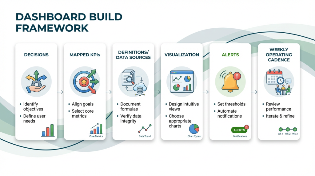
How To Build a SaaS CEO Dashboard Template That Drives Smarter Decisions
Most founders waste weeks building dashboards that don't help them decide anything. Here's how to build one that actually drives action by starting with your decisions and working backward to the data.
- Map your top 5 weekly decisions first. List what you decide each week (hire, price, spend, prioritize, forecast) before opening any BI tool.
- Design a single-page view that fits one screen. Your dashboard should tell the complete story without scrolling or clicking through tabs.
- Set automatic alerts at decision thresholds. Configure warnings when NRR drops below 100% or CAC payback exceeds 18 months to trigger immediate action.
- Standardize 85% of components from proven templates. Reuse established metric definitions and visual formats, then customize 15% for your specific business model.
- Run focused 31-minute weekly reviews. Schedule consistent executive meetings where exceptions get flagged, and decisions get made, not just reported.
This decision-first approach transforms your dashboard from a reporting tool into an operating system. When metrics connect directly to the choices you make each week, you spend less time analyzing data and more time acting on insights.
Best Practices for Customizing Your SaaS CEO Dashboard
Building a dashboard that works for your specific business model requires more than copying someone else's template. Generic dashboards miss the nuances of your pricing model, customer segments, and growth stage that investors scrutinize during funding rounds. The most effective approach starts with documenting exactly which metrics drive your weekly decisions, who owns each number, and how often you need to review them.
Revenue
- Net New ARR: New bookings + expansion − contraction − churn. Source: CRM + Billing. Owner: VP Sales. Review: Weekly.
- Sales Efficiency: New ARR / Sales & Marketing Spend. Source: CRM + Finance. Owner: CFO. Review: Monthly.
Retention
- Net Revenue Retention: (Starting ARR + Expansion − Contraction − Churn) / Starting ARR. Source: Billing System. Owner: Customer Success. Review: Monthly.
- Logo Churn Rate: Customers Lost / Starting Customers. Source: CRM. Owner: Customer Success. Review: Monthly.
Efficiency
- CAC Payback Period: Customer Acquisition Cost / Monthly Recurring Revenue. Source: Marketing + Finance. Owner: CMO. Review: Monthly.
- Magic Number: Net New ARR / Prior Quarter S&M Spend. Source: Finance System. Owner: CFO. Review: Monthly.
Cash
- Cash Runway: Current Cash / Monthly Burn Rate. Source: Finance System. Owner: CFO. Review: Weekly.
- Burn Multiple: Net Burn / Net New ARR. Source: Finance System. Owner: CFO. Review: Monthly.
- 13-Week Cash Flow: Rolling forecast of cash in/out. Source: Finance System. Owner: CFO. Review: Weekly.
Product
- Monthly Active Users: Unique users with meaningful product engagement. Source: Product Analytics. Owner: CPO. Review: Weekly.
- Feature Adoption Rate: % of customers using new features. Source: Product Analytics. Owner: CPO. Review: Monthly.
Lock these metric definitions and assign clear ownership to prevent the dashboard drift that confuses boards and investors. When you need to change a calculation, update it in one place and communicate the change to all stakeholders. Proper data governance prevents the confusion that kills trust in your numbers. Segment every metric by customer cohort, product line, and plan tier so you can spot where growth concentrates and where churn threatens your SaaS metrics performance.
SaaS CEO Dashboard Template FAQ
Building a CEO dashboard raises practical questions about tools, governance, and metric selection. These answers come from real operator experience helping founders implement board-ready dashboards that drive weekly decisions.
What tools should I use to build the dashboard—spreadsheets, BI, or both?
Start with spreadsheets for quick testing and metric validation at startup speed. Once you prove the framework works, migrate to a BI tool like Tableau or Looker for automated updates. Many successful CEOs keep a hybrid approach—BI for daily operations, spreadsheets for board scenarios, and modeling.
How often should the CEO dashboard be reviewed and updated, and by whom?
Review weekly in a focused 30-minute executive meeting with consistent attendance. The CEO should sponsor the meeting, but assign a single owner from finance or operations to maintain data quality. Weekly reviews create accountability and catch issues before they compound into bigger problems.
Which 8–12 KPIs should make the top-level view, and what goes into drill-downs?
Start with eight core metrics for the executive view: ARR, net new ARR, gross revenue retention, net revenue retention, CAC payback, LTV/CAC ratio, burn multiple, and cash runway. Add 2-4 model-specific KPIs as needed. Drill-downs should segment by cohort, product line, and customer tier to reveal where growth concentrates.
How do I handle data quality issues when building the dashboard?
Start with imperfect data and improve incrementally at startup speed. Establish metric calculations upfront and document assumptions clearly. Assign data ownership to prevent conflicting interpretations. Consistent calculations matter more than perfect accuracy in early versions—you can refine precision as your data infrastructure matures.
Should I include product usage metrics on the CEO dashboard?
Include 2-3 usage metrics that predict retention, like daily active users or feature adoption rates. Avoid vanity metrics that don't connect to revenue outcomes. Product engagement belongs on the CEO dashboard template only if it directly correlates with expansion or churn patterns in your specific business model.
Turn Insight Into Action With a Purpose-Built CEO Dashboard
A board-ready SaaS CEO dashboard isn't about tracking every metric—it's about aligning the right KPIs to your weekly decisions. Research shows that poorly designed dashboards create noise instead of clarity, but a purpose-built template focused on revenue, retention, efficiency, and cash gives you the signal you need. Set alert thresholds, run tight weekly reviews, and enable faster, data-driven decisions across your team.
When built correctly, AI-enhanced KPIs become predictive tools that drive growth instead of just reporting it. The real question is how to scale efficiently with the right dashboard framework without burning cash or missing investor expectations. FinUp Partners' fractional CFOs bring proven frameworks from Fortune 100 companies, standing up investor-ready reporting and operating discipline in weeks, not months. You get the expertise to avoid costly missteps while keeping your runway protected.
Ready to build a dashboard that drives decisions instead of just displaying data? Get expert guidance from FinUp Partners and turn your metrics into a growth engine.